Speed Reading on Screens and Digital Devices
E-books make up 21% of book sales with a total of 191 million e-books sold in the United States alone in 2020. In the same year, more than two thirds of individuals in Great Britain were either reading or downloading online news, newspapers or magazines. If you add in emails, tweets, Facebook, LinkedIn and blog sites it is clear that Speed Reading from a screen is a vital skill.
With reading from screens becoming almost ubiquitous, we need techniques which are suited to digital media. The same tried and tested techniques used for physical documents can be adapted slightly for the modern age. A major benefit of digital documents is the ability to modify formatting to make them more easily readable. This leads to faster speed, better comprehension and less eye strain.

The Best Kit
Choice of device is important. Trying to read on a small smartphone screen will be far from ideal. You get fewer words to a line and less ability to use your peripheral vision. You can invest in a bigger phone if you don’t mind whether It’ll fit in your pocket and can afford the hefty price tag. There are a lot of high-end big phones on the market, like the iPhone 13 Pro Max with a 6.7-inch screen or the Samsung Galaxy S21 Ultra with a 6.8-inch screen. Foldables also provide a relatively large screen. The Kindle Paperwhite (300 pixels per inch, 6.8 inch, glare free screen) or Kindle Oasis (300ppi, 7 inch, glare free screen) are similar dimensions.
I’d recommend a device with a screen comparable in size to a physical book such as a tablet or 13 inch (or bigger) laptop. Preferably with a 4K, Apple retina display, or what Microsoft call “eye limit” display. This is an image that is essentially indistinguishable from a printed page like a magazine, with pixels that are unable to be individually seen. You don’t have to spend a fortune on the latest tech. The techniques still work on a modest device, but if you tend to read a lot from screens it may be worthwhile upgrading. If you read less then there is always the option to print out important documents.
Readability
Depending on the type of document you’re reading there are things you can change to improve ease, and hence speed, of reading. For example, in iBooks if you click on settings, you can choose from eight different typefaces. You can change to sepia tone or inverted white text on grey or black and have a bit of control over font size. With websites and PDF documents you’re pretty much stuck with the publisher’s choice of formatting. Microsoft Word (or equivalent) documents have many more possibilities.
Typeface
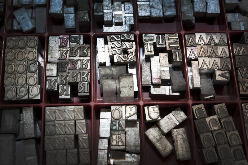
Incidentally the word ‘font’ is often used incorrectly. It stems from the olden days when typesetting involved using metal blocks of ‘type’. A font was a particular size, weight and style of a typeface. Each font was a matched set of type, with a piece for each character or symbol. For example, Helvetica is a typeface family, Helvetica italic is a typeface, and Helvetica italic 10-point is a font. When I was very young my mother had a little print business run out of the small bedroom. She printed business cards, menus and table plans for functions and the like. I can vaguely remember her boxes of metal type and sheets of ‘Letraset’ transfers. Maybe this is where my geeky interest in typefaces comes from.

There are broadly two kinds of typeface. That is, Serif fonts (also known as Roman) and Sans-Serif (also known as Gothic). Serifs are the twiddly bits on letters. The dictionary says, ’The short lines stemming from, and at an angle to, the upper and lower ends of the strokes of a letter.’ The origins of serifs are not definitively known. One theory is that in ancient Rome, letter outlines were first painted onto stone, and the stone carvers followed the brush marks. These flared at stroke ends and corners, creating serifs.
When reading from a screen the serifs tend to look indistinct. It is far easier on the eye to choose a sans-serif typeface. The Verdana typeface family was created specifically to address the challenges of screen-based text. It was designed for Microsoft by Matthew Carter. Helvetica is a widely used sans-serif typeface which is clean and easy to read and has been popular in publishing since the 1960s. Arial shares some similarities and is commonly used as an alternative to Helvetica. Choose whichever you feel comfortable with. Any sans-serif typeface will most likely work well on screen.
Size and Spacing
Inter-line spacing within a paragraph can also have an impact on readability. This should be sufficiently large so that the lines of text don’t start blurring together. The 1.5 space option seems to work best but this is down to personal preference.
Text size will depend on the screen size and the distance from your eyes. I tend to like 12 point on a computer monitor. In metal type, point size refers to the height of the metal body on which a typeface's character is cast. In digital typefaces, the metal body is replaced by an invisible box which each character fits inside. (One pica equals 12 points, and there are 6 picas to an inch. So a point is 1/72 inches) To maximise your focused vision sit with a distance of about 50cm between your eyes and the screen, as long as this is practical and comfortable. Scale the text appropriately for this distance.
Colour
There is a whole science devoted to colour with many different models. In printing, colours are defined by a percentage of cyan, magenta, yellow and black (called CMYK). On screens colour is often defined by red green and blue light (RGB). This can be expressed as a six digit Hex Code. Each pair of digits is a value in base 16 between 00 and FF (that is 255 as a decimal). The first two letters/numbers refer to red, the next two refer to green, and the last two blue. This gives over 16.5 million colours.

Another way of defining colour is HSB. According to this model, any colour is represented by 3 numbers. The first number is the Hue, from 0 to 360 degrees on a colour wheel. All colours of the rainbow are represented. The second number is the Saturation. It represents the percentage amount of colour from 0 to 100, where 0 represents no colour, while 100 represents the full colour. Finally, the third number is the percentage Brightness. The more this value tends to 0, the lighter the colour is. The more it tends to 100 the darker the colour is.
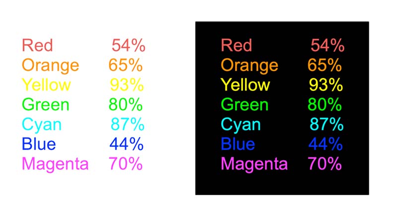
If we set both saturation and brightness to 100% and just consider hue then each ‘colour’ has an associated relative luminance value. The 'Color Usage Research Lab' at NASA Ames Research Centre studied luminance for instrumentation displays. Readability requires a high ‘luminance contrast’ between background and text. White has a luminance of 100% and black 0%. Yellow has a high luminance of 93% so is hard to read on a white background but easy on a black one. Red has a midway luminance of 54% so is readable on both black or white. Blue, at 44%, is very hard to read on black but clear on white. Of course, the maximum luminance contrast is black text on a white background (or vice versa) but this can feel a bit too harsh. Blue on white is easier on the eyes. Green or orange text on a black background stand out well. Experiment to find which colour combinations feel most comfortable for you.

To avoid undue eye strain set the brightness of your screen to an appropriate level. Brighter when there’s a lot of ambient light in the room and less bright if the room is dim. Some devices automatically adjust accordingly but it is easy to do this manually in the ‘settings’.
Guiding Techniques
When reading printed books, a key technique is smoothly moving a visual guide such as a pencil or chopstick under the lines of text. This aids eye tracking, builds a steady rhythm and avoids bad habits like back-skipping or wandering off the page. When reading from a screen, you can use a guide just as you would with printed media. The only difference being that you need to hold this a short distance in front of the screen to avoid scratching it. If using a touch screen device make sure you use a non-conductive guide to avoid inadvertently turning pages. You can use the computer's mouse pointer as a guide but this can sometimes be tricky to keep to a line, especially on closely spaced text.
Emails
A 1999 study by Gallup for Pitney Bowes inc. (Messaging Practices in the Knowledge Economy) showed that the average UK worker sends and receives on average 171 messages a day and is interrupted every ten minutes. This is disastrous for productivity. Set aside specific times each day devoted to answering important emails instead of replying instantly. You will be able to focus on one thing at a time without constant interruptions, achieve what you set out to do and have more time.

Is Print Media Dead?
I think there will always be a place for physical books. Reading from a screen feels sterile. I love the feel of a book, whether the silky smoothness of a lavishly printed glossy book or the more utilitarian feel of a paperback. I love the smell – ‘eau de bookshop’. I love the sensation of turning the pages to reveal the secrets within.
Research in 2019 by Virginia Clinton, assistant professor of education at the University of North Dakota indicates that when reading nonfiction, students of all ages tend to absorb more when they’re reading on paper than on screens. There is not yet a clear explanation of the reason for this. Theories include blaming glare and flicker of screens and better spatial memory for the location of information on a physical paper page. In tests, screen readers consistently overestimated their reading comprehension, whereas those reading on paper were more accurate in their self-assessments. Clinton suggests, people who overestimate their abilities are likely to put in less effort and therefore perform less well.

